Introducing the Referral Feature
Following russia's invasion of Ukraine in Feb 2022, a humanitarian crisis led many Ukrainians, including IT professionals, to seek refuge abroad.
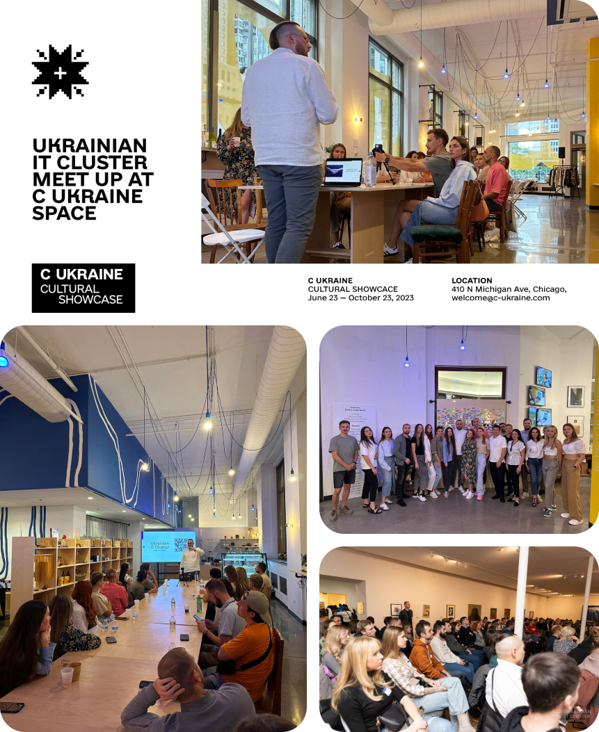
The UITC team approached me to design a Referral Network Feature, connecting newly arrived Ukrainian IT specialists with the professional community, facilitating integration and support.
Duration
3 months
Initially tasked with designing the Referral Board Page, I later took on redesigning the Sign-Up and Home Pages to improve usability and cohesion. I also developed a design system with a reusable component library, streamlining workflows and ensuring platform consistency.
Role
Figma
Tools
Inga Duong, Anna Nazarevska, Iryna Tysiniuk, Vadim Zavertaliuk, Pavao Odak, Svyatoslav Yurinets, Oleh Smolikevych
Team
UX Design, Market Research, A/B Testing, Hi-Fidelity UI, Accessibility Evaluation
Skills
Research
Understanding Ukrainian IT Community
Ukrainian IT professionals may need to build a new network of contacts within the American IT sector.
They may face difficulties adapting to the American tech ecosystem, which is highly competitive and fast-paced.
Synthesis
When I joined the project, the team had already conducted initial market and user research.
The main challenge for me, was to quickly adapt and integrate into the existing workflow. I needed to synthesize existing research and gather crucial insights to drive the project forward.
Navigating Constraints
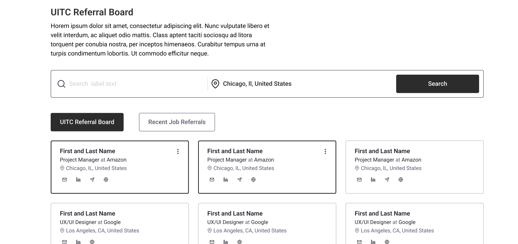
I started designing the initial versions of user cards. The card content underwent significant changes as the project progressed, driven by adjustments to the user flow and technical challenges in integrating sign-up form data into the card design.
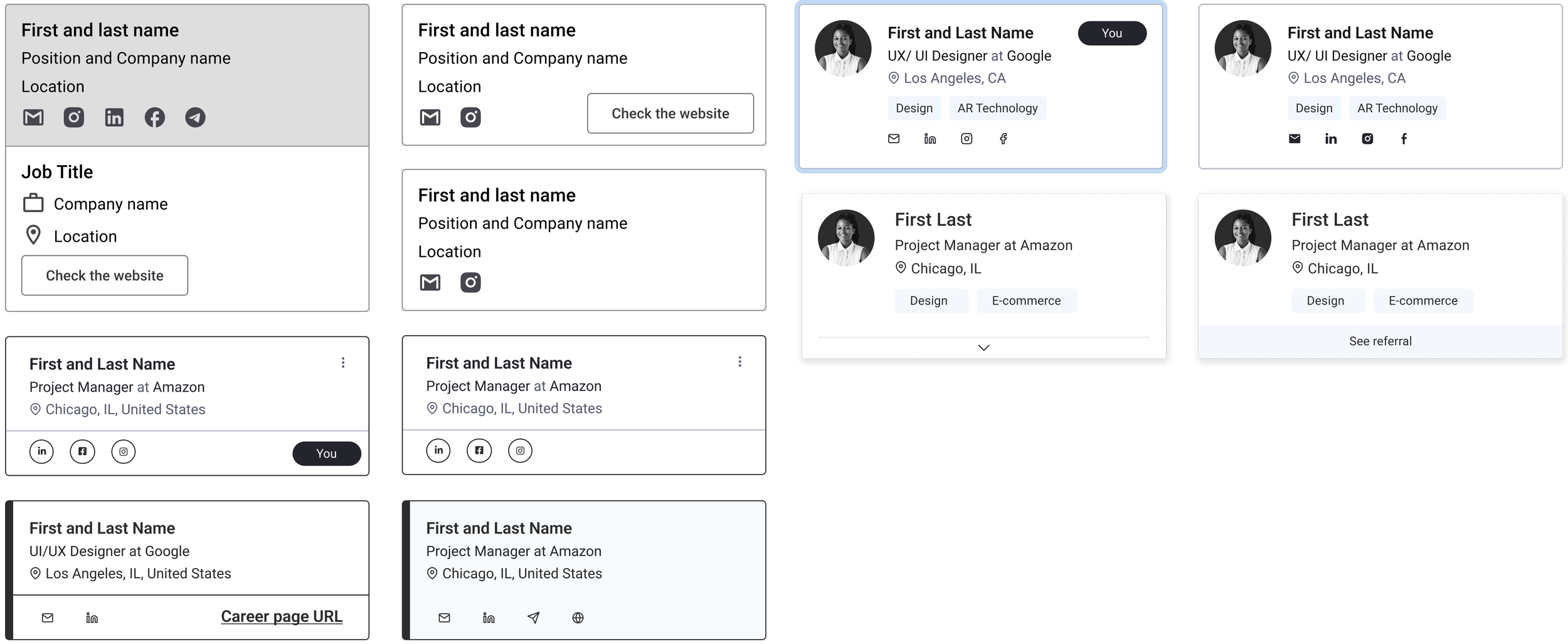
Throughout the iterations, I ensured that the following essential information remained present:
Name: The user's full name or chosen display name
Position: The user's professional title or role
Location: The user's city, state, or country
Social links: Links to the user's social media profiles or platforms
Referral link: A direct link to the referral
First Challenges
After numerous discussions with the teams and testing with developers, we identified several technical and user flow challenges.
I then redesigned the final versions of the user cards with these constraints in mind:
Technical constraints: no profile photos
Time constraints: tags difficult to implement
Design priorities: distinct identification of "My card" and "Community cards"
User, Content, Context
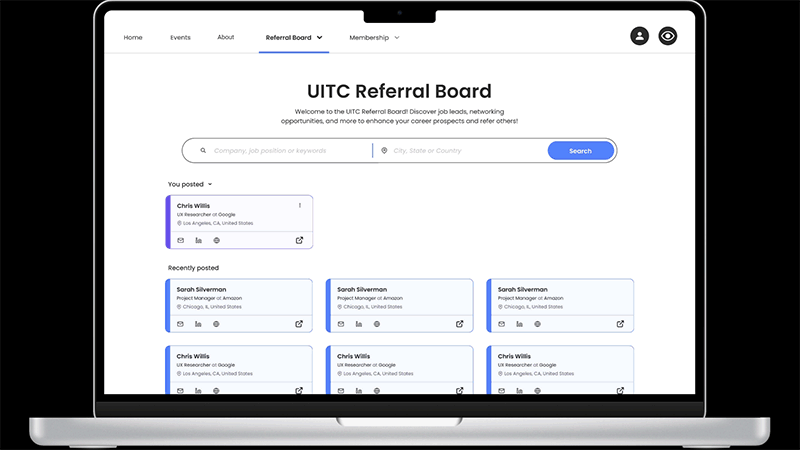
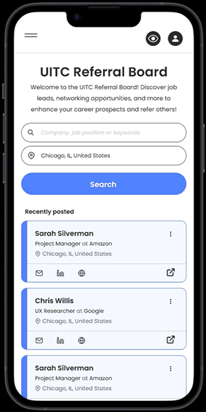
Usability testing revealed that the initial Referral Board Page design confused users, who struggled to:
Differentiate between 'UITC Board' and 'Recently posted' sections
Identify their personal cards among community cards
What Worked?
To make the design more intuitive, we decided to:
Get rid of the confusing tabs
Add collapsible sections
Change UX writing to "You posted" and "Recently Posted"
Separate user's and community cards
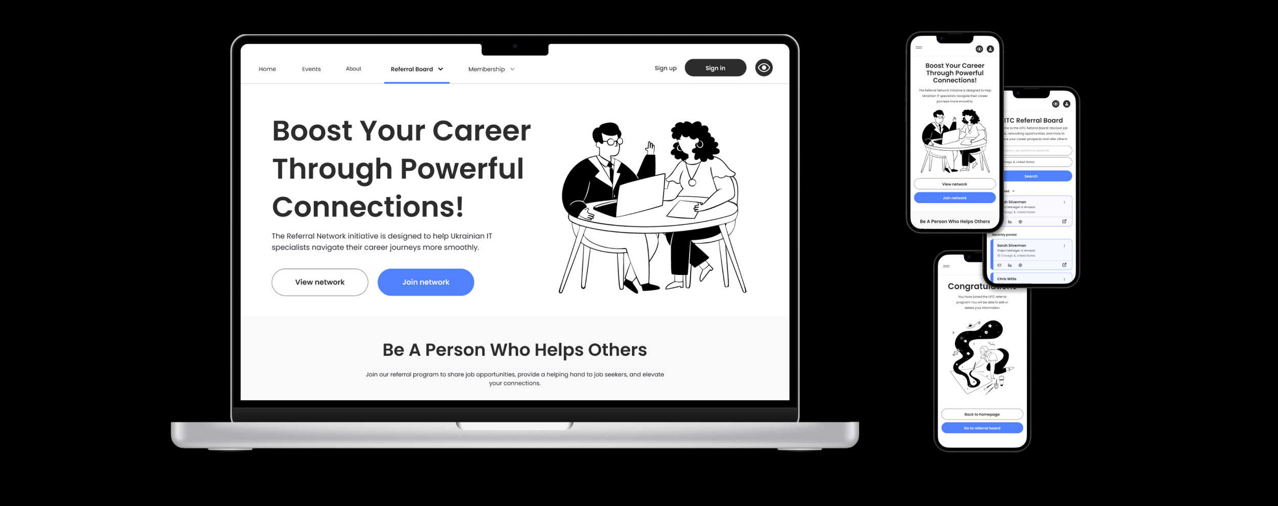
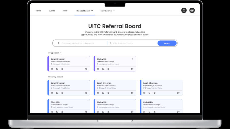
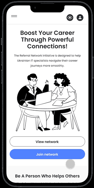
Web and Mobile
I then designed all interactions for both web and mobile versions of the page. This included:
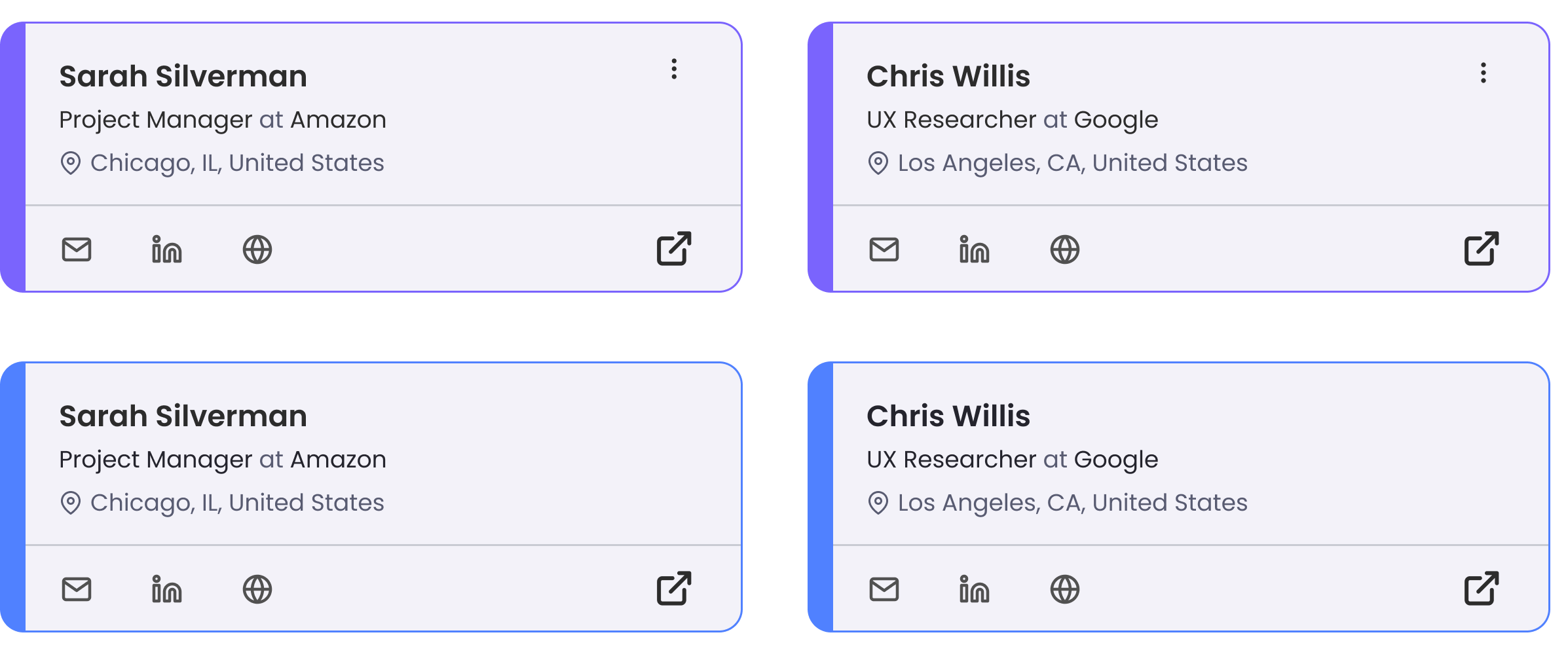
Card management: We prioritized card management to enable users to interact extensively with their cards, as personal profiles were not ready at launch. This decision allowed users to still engage meaningfully with the platform by editing and deleting information.
Search feature: A prominent search bar with filtering options by location, position, company, or keywords.
Responsive design: Design elements adapted to different screen sizes and devices, ensuring a consistent experience across web and mobile platforms.
Building Blocks
I designed a robust component set, laying the groundwork for a development of a comprehensive design system. This component set enables consistent and scalable design across the platform

Accessibility
To ensure an inclusive experience for all users, I integrated a consistent accessibility feature in the website's header.
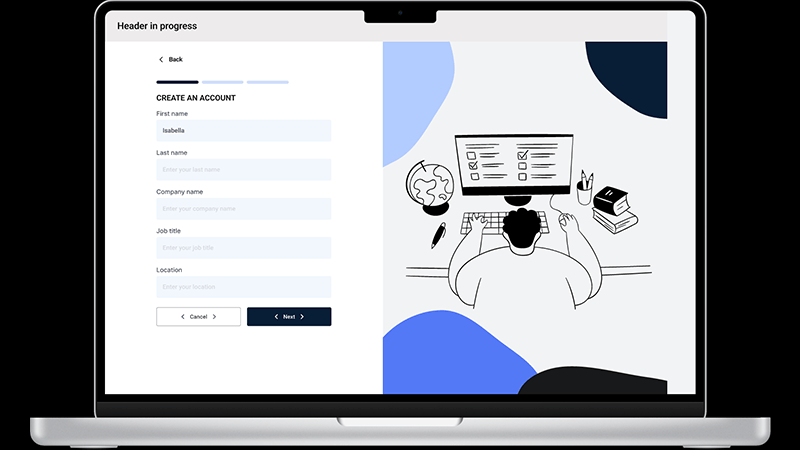
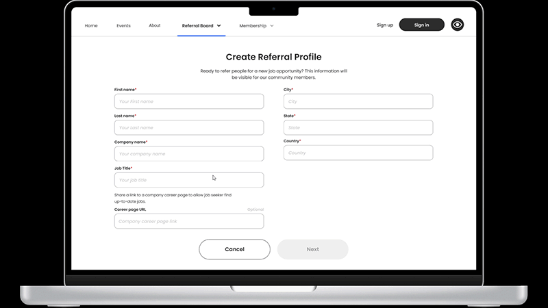
Unexpected Pivot
I was then tasked with redesigning a registration form. When a sudden project scope change removed the Sharing Referral feature, I had to quickly adjust the registration flow. We focused on using the information on a registration form to be used as a referral card, while removing the “sharing” option.
Actions:
Collaborated with the development team to understand the technical constraints and feasibility of the revised design
Conducted a rapid user flow analysis to evaluate what information on the registration form can be displayed on the user’s card
Implemented a redesigned flow that maintained core functionality and user experience
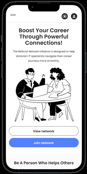
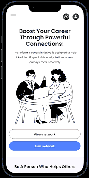
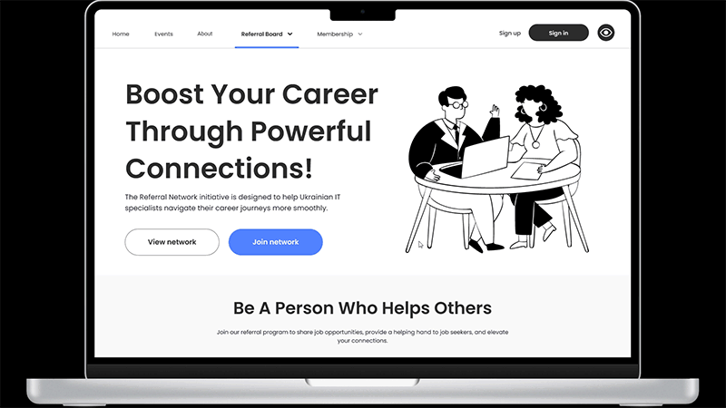
Landing page
To effectively communicate the value of the referral network, I designed a clear and concise homepage that showcases key information and encourages users to join.
Key Elements:
Hero Section: A prominent headline and supporting text explain the purpose of the platform, highlighting the benefits of seeking and sharing referrals and connections.
How it Works: A concise FAQ section answers essential questions, providing clarity on the referral process and user roles.
Call to Action (CTA): Prominent CTAs invite users to join the network, emphasizing the value of participation.
What I’ve learned?
The nature of non-profits is dynamic, with constant changes in direction and limited resources. Staying flexible and adaptable was crucial to overcoming sudden obstacles and shifting priorities.
It taught me that even in the face of uncertainty, staying focused on the end goal and being open to change can lead to growth and learning. I'm grateful for the experience and look forward to applying these lessons to future projects!
The project has yet to go live due to a change in the direction of the organization. But still successfully met all deadlines and received positive feedback from stakeholders.
