Mai Anh App
Your favorite tastes of home, just a click away
Drinks
Noodles
Lunch
Rice
Soup
Chicken
Drinks Noodles Lunch Rice Soup Chicken
Chicago, United States
What
Mobile App (IOS)
Where
Designer, Researcher
Why
Portfolio Project
Role
Feb 2023- Apr 2023
Category
E-commerce, Food and Drinks
When
Why I made this?
I created this project to help Mai Anh Restaurant attract a younger demographic and make it easier for all customers to navigate their extensive menu. With so many dishes to choose from, the app allows users to quickly browse, place orders, and reserve tables—no phone calls needed, which previously had been a barrier for younger people and non-native speakers. It’s a streamlined solution that enhances the restaurant’s online presence and connects with the next generation of diners who value simplicity and convenience.
Discovery
Project background
Mai Anh Restaurant is facing difficulty attracting and retaining new customers, particularly among younger demographic.
The restaurant operates in a competitive market, and the absence of their online presence has made it challenging to reach potential customers.
As a result, Mai Anh Restaurant has experienced limited growth in recent years.

Market Research
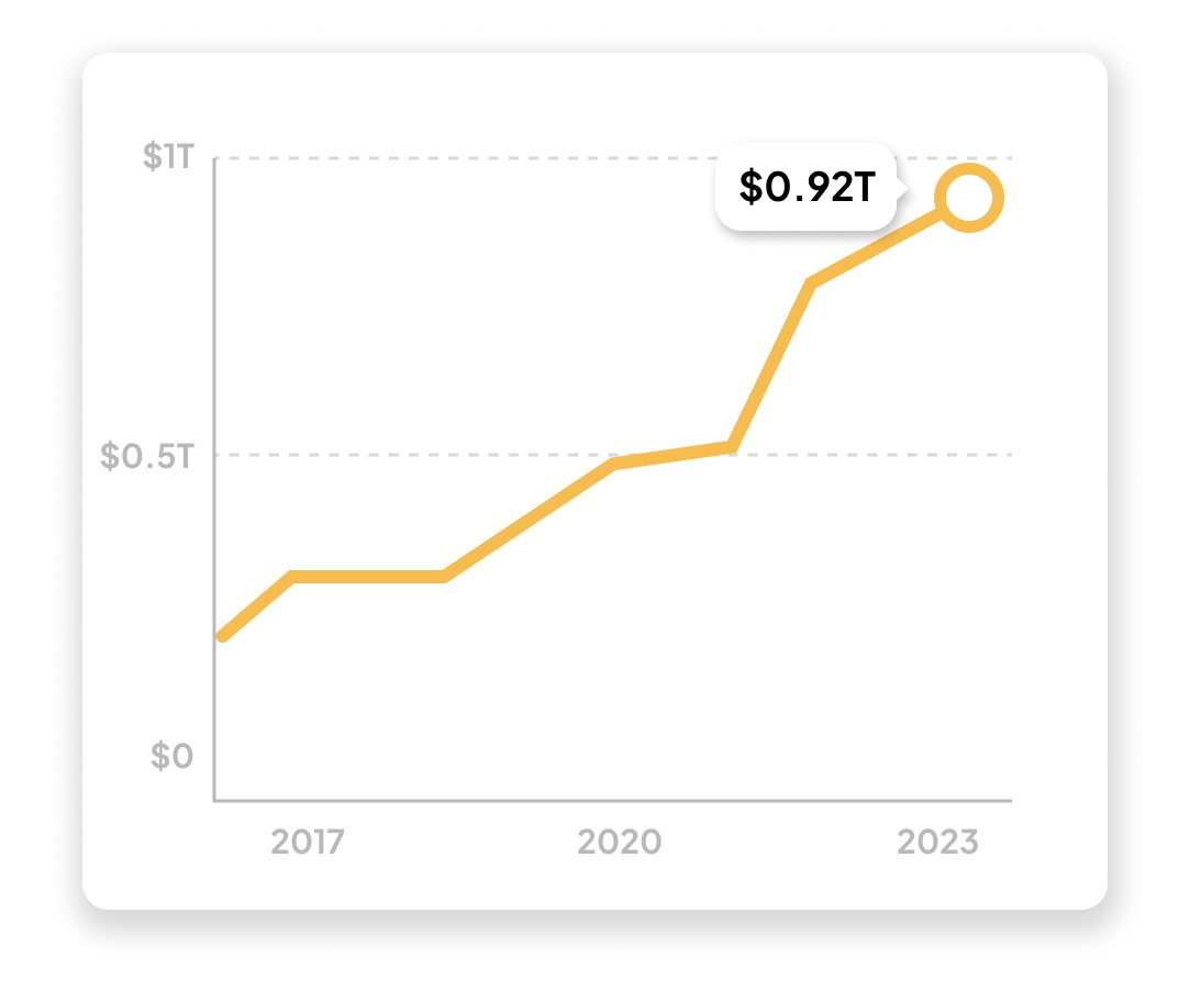
The Global Food Delivery Mobile App Market is forecasted to grow significantly, with a projected value of 1 Trillion U.S. dollars in 2023, with 75% of restaurants now offering mobile app-based ordering.
Insight:
Businesses without a responsive online presence often find themselves at a disadvantage against competitors.
Poorly designed or complex interfaces can confuse customers, leading to lost sales.
Problem:
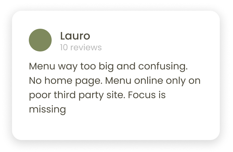
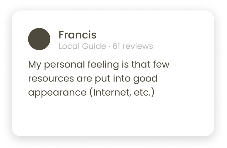
Problems from Google reviews
Competitive Analysis
I’ve analyzed 3 main competitors (2 direct, 1 indirect) in the area, comparing their online ordering experience, what they do well and what needs improvement.
Positives
2/3 had clean design and easy-to-find key info on their website
2/3 had good quality images and food photography.
Desktop website experience
3/3 were easy to navigate
1/3 had clearly marked buttons and call to action.
Navigation
2/3 had all key info present, were straight to the point and relevant to the target audience.
Descriptiveness
2/3 had versions with different languages available.
Accessibility
Negatives
2/3 had no menu available
2/3 had confusing layout.
App or mobile website experience
2/3 had no clear hierarchy.
2/3 had the "Menu" and "Order" features were not easy to spot.
User flow
3/3 had no more then 3 features
Features
3/3 had no consistent brand identity.
Brand identity

User Survey
I conducted user interviews both in-person and via Zoom, with a target audience of users aged 18-45, full-time office based and remote workers, who order food from restaurants at least once a week, including participants of different genders, and ask them questions:
Preferences & Habits
What are your favorite restaurants in Germany, and why?
Can you describe your ordering experience at these restaurants?
How often do you order food online vs. dine out?
App Usage
What are your favorite food ordering apps, and what features do you like most?
Are there any features you wish were available on food ordering apps?
Digital Engagement
What’s your preferred way to interact with restaurants online, and why?
Do you book tables online or prefer calling? Why?
How long does it usually take to order food online? Any challenges?
Decision Factors
What key factors influence your choice to visit a new restaurant?
How do you typically discover new restaurants to try?
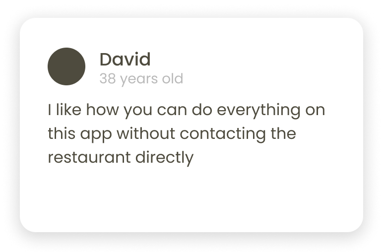
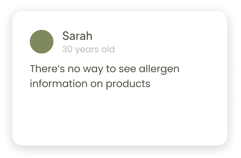
Notable comments
Research findings
As the demand for efficient and convenient online food ordering rises, users seek easier ways to interact with restaurants. A clear menu, strong brand identity, and practical features play a crucial role in users' decision-making when choosing a restaurant.
Personas
I created two personas based on the target audience the restaurant is trying to reach.
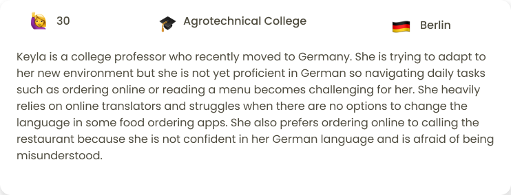
Keyla Isbell
College professor
'“I would order more but as a non-native speaker I usually avoid direct communications”
Goals
To be able to order online from her favorite restaurant
To be able to research a restaurant and what they had to offer
To reduce stress from miscommunications
Frustrations
Restaurants in Germany rarely have English versions of the app
She often finds menus and navigations confusing and poorly structured
Food apps often lack corresponding pictures making it hard for her to decide.
Goals
Alex Fongern
Therapist
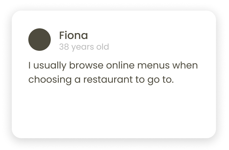
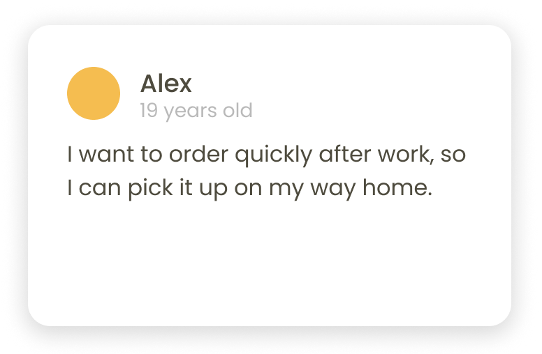
I would like to do this task quickly before I get home from home from work
To access diverse menu options for various cravings and dietary needs.
Receive accurate and timely deliveries that fit into his busy schedule.
Quickly place food orders during work breaks without wasting time.
Frustrations
Navigating through complicated ordering processes can frustrating.
Finding limited food choices can be disappointing and unsatisfying.
Late deliveries or incorrect orders disrupt their tightly packed work routine.
Develop
Ready, set, design!
Following market and user research, I dove into the process by outlining initial flow sketches and crafting low-fidelity wireframes.

Flow Diagram
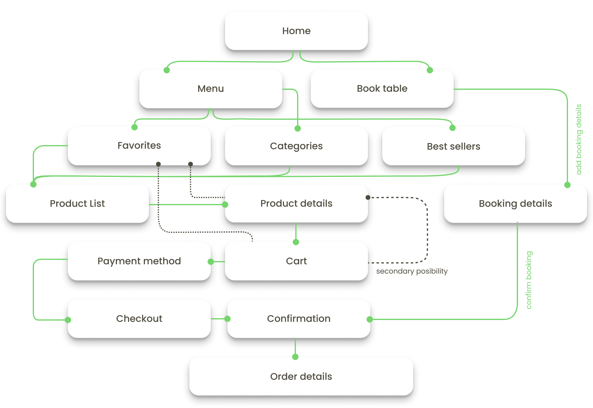
I created a simple flow diagram of 3 main tasks the user can perform in the app “ordering for pick up”, “book table” and “order from favorites”.
Wireframes
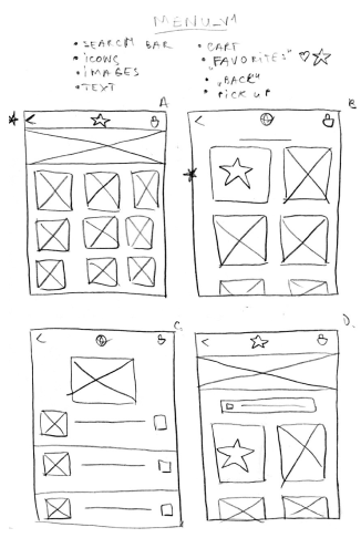
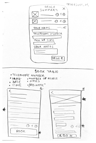
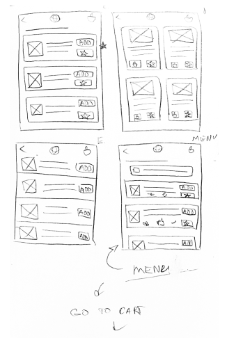
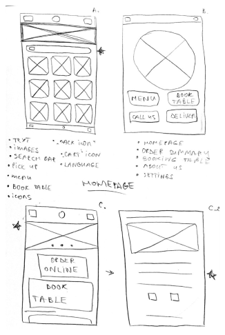
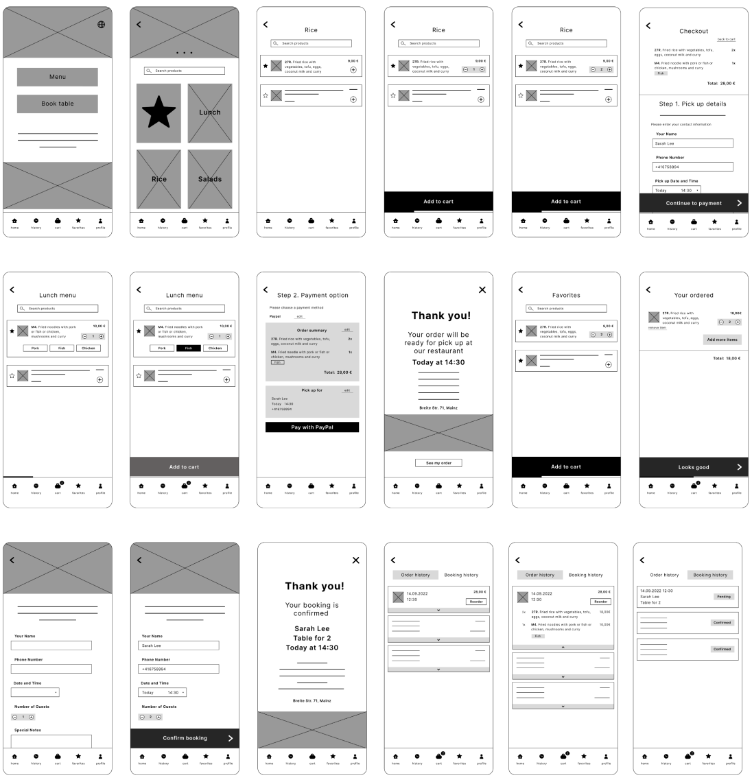
Once I figured out the main flows I started sketching out low-fidelity wireframes.

Low fidelity prototypes
I then created an initial low-fidelity prototype to conduct my first round of usability testing.
Testing
Usability Study
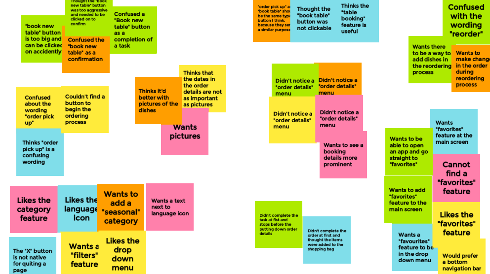
I conducted a usability study with 5 in-person and via Zoom participants to test the prototype and gather feedback. Then, I organized their comments into themes using affinity mapping.
What I’ve learned?
By observing participants’ interactions, identifying challenges, and understanding their frustrations, I extracted key themes and insights to guide the next design iteration in the implementation phase.
Insights
Buttons on the confirmation page should not look like a call to action
Make all the buttons with similar purposes to be similar and call to action.
Every order and item should include a corresponding image
Frustrations
Most users confuse the buttons on the confirmation page as a call to action.
Most users didn’t recognize the “book table” button as clickable
Most users are more comfortable navigating their purchases with pictures.

High-Fidelity UI Design
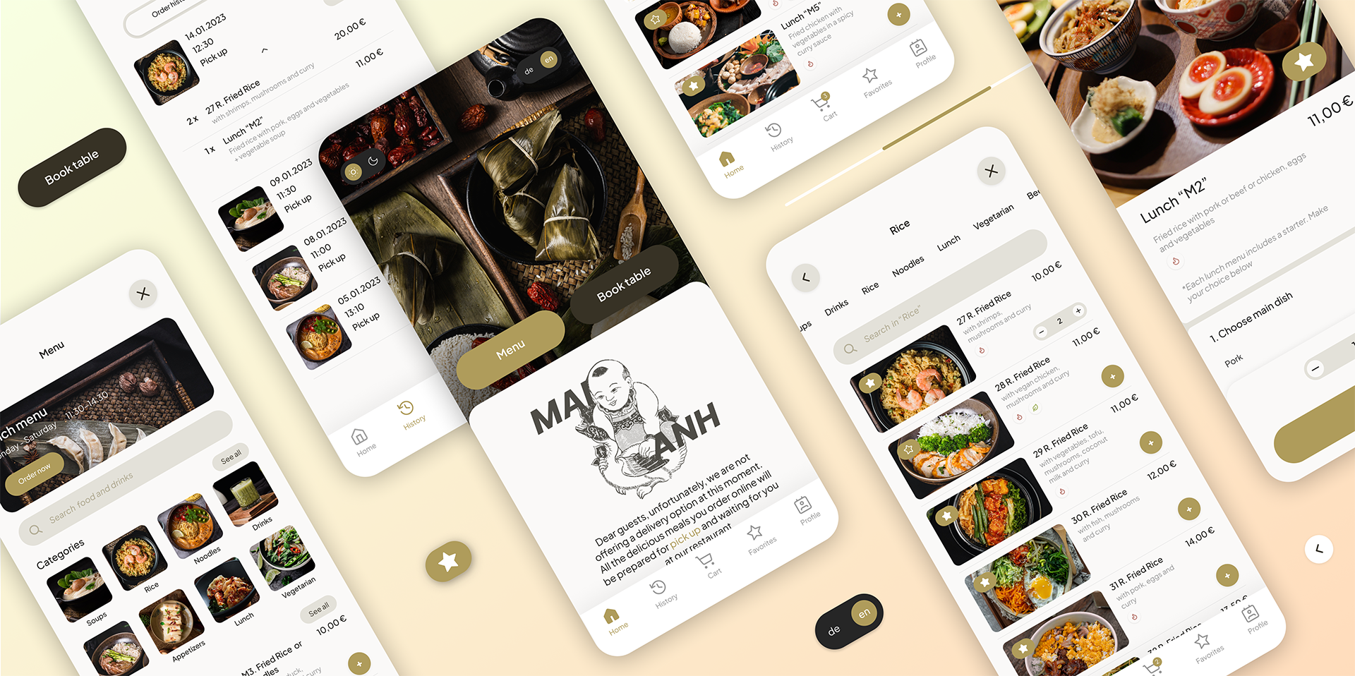
After making changes based on previous findings I was set to create High-Fidelity UI Design for Mai Anh App.
I created a high-fidelity prototype to test with an initial group of users. I conducted tests with 5 participants using this prototype, assigning them 5 tasks within the app. Throughout each task, I recorded their behaviors, opinions, and attitudes, noting any errors, issues, or points of confusion and positive and negative feedback in their own words. After each task, participants rated their difficulty on a scale from 1 to 3.
Findings
Most participants (4 out of 5) rated the app’s task difficulty as 1 out of 3.
Some users expressed a desire for more customization and filtering options.
A few participants didn’t initially notice the “Book Table” button, as they were accustomed to restaurant apps that handle table booking through phone calls. This led them to first look for a “Contact Information” section.
High-Fidelity Prototype
Accessibility evaluation
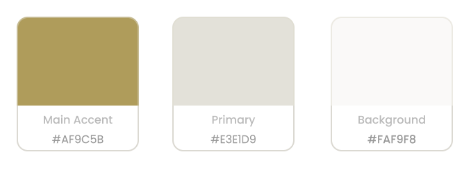
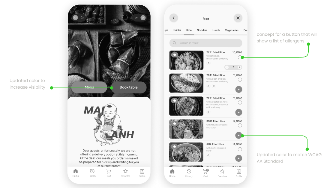
While assessing the app’s contrast against WCAG AA Standards, I found that two of the primary colors did not meet the required contrast levels.
Ways to improve
Increase the visibility of the “Book Table” button (e.g., by changing the color).
Conduct additional interviews to assess if the “Book Table” feature is widely needed.
Add a pop-up for each product to display dietary restriction information.
Implement a “filter” feature based on user feedback.
Project Insights:
Reflecting on this project, I can see where initial research could have been deeper to avoid challenges like feature visibility and balancing customization without clutter.
However, several things went well: the usability testing provided clear, actionable insights, and user feedback directly informed meaningful improvements.
The biggest lesson I learned was the importance of anticipating user habits early on—like the tendency to search for contact info instead of a “Book Table” button—to create a smoother user experience. I’m proud of the progress made and excited to someday make this app a reality.


